Growing Through Metrics
Estimated read time: Less than 10 minutes
Overview
The Metrics Dashboard gives you a quick, high-level view of how your patients are engaging in care over time. You can find it in the Provider Portal under the Metrics tab.
These metrics reflect three core pillars of patient care at Nourish: patient satisfaction, patient retention, and patient outcomes (outcomes measurement is underway and will be added soon). Together, they help paint a fuller picture of how patients are experiencing care and progressing toward their goals.
Because patients need time and continuity to reach meaningful outcomes, retention is one of the signals we use to guide new-patient scheduling. This dashboard is designed to make that connection transparent and actionable — showing how your current retention trends relate to scheduling visibility, and highlighting areas where small adjustments can make a meaningful difference.
At a high level, the metrics show how your patients progress across key care milestones — 3, 6, 9, and 12 appointments. These benchmarks are based on trends across all Nourish RDs and patients, and the expectation is not that 100% of patients reach every milestone. The green zones on the dials indicate healthy target ranges (for example, for the 12-appointment milestone, the green target begins at just 10%).
Overall, this dashboard is meant to be a reflection and coaching tool — a way to spot patterns, recognize what’s working well, and know when it might be helpful to lean on additional resources or guidance. Progress often happens incrementally, and even small improvements can have a meaningful impact over time.
The sections below provide a brief introduction to help you get oriented as you start your journey at Nourish. For deeper guidance, you can explore our Guide, Video Walkthrough, and FAQs.
Section 1: Your Retention Score Relative to Nourish Peers
This section shows your overall retention score on a 0–6 scale. (As a new RD, this data will continue to populate (and will reflect your all-time retention so far) but does not impact scheduling during your onboarding phase.)
The score is calculated by equally weighting four key milestones—the % of your patients who reach 3, 6, 9, and 12 appointments.
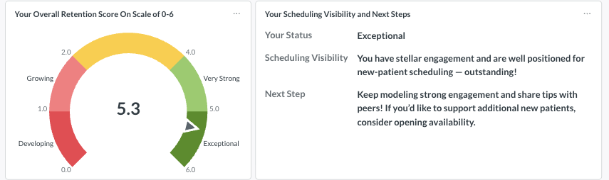
The table on the right of this dial also displays how your score impacts scheduling and tailored next steps for improving retention.
Section 2: Your Current Retention Scores Across the Patient Care Journey
The four dials in this section show how your patients are progressing across the key milestones of the care journey:
Foundational Care (3 appointments) – Establishing the initial phase of their care journey.
Initial Care Cycle (6 appointments) – Building momentum and achieving early goals.
Long-Term Care
(9 appointments) – Sustaining care beyond the first cycle.
(12+ appointments) – Reaching long-term consistency in their journey.
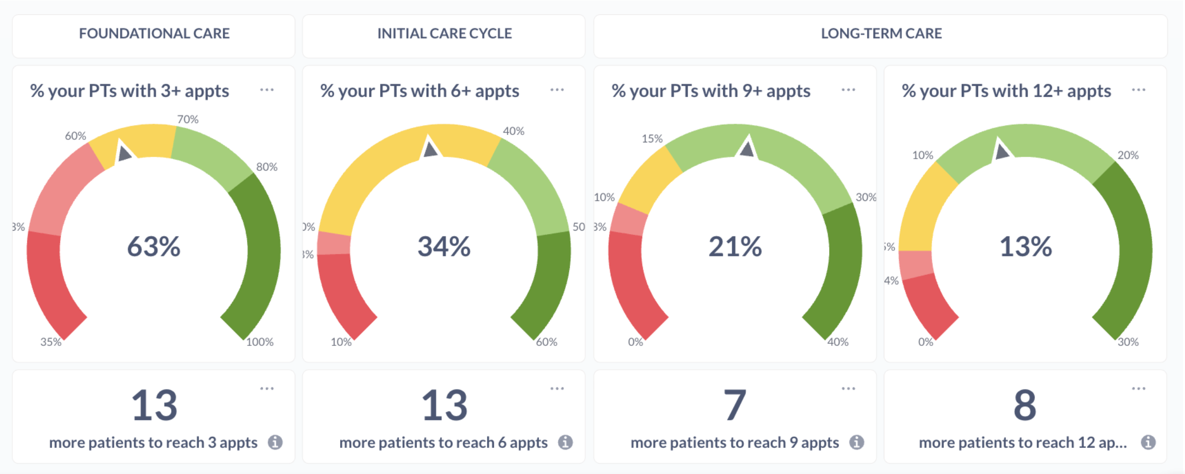
Below each dial, you’ll see how many additional patients would need to reach that milestone to move into the next color band. For example, “13 new patients to reach 3 appts” means that if 13 more patients from your current caseload reached 3 sessions, the dial would shift into the next range (such as from yellow to green).
These values update daily and may change naturally as patients progress through care.
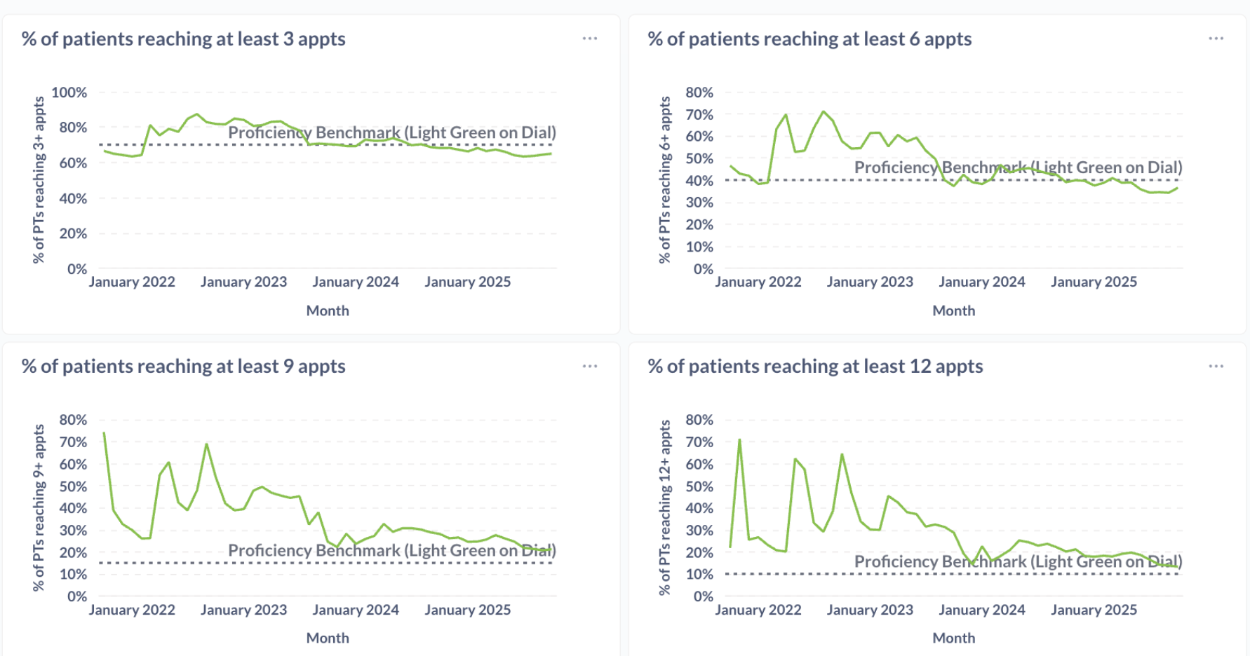
Section 3: Your Retention/Dial Scores Over Time
These charts show how your retention dials have changed over time, offering a longer-term view of patient engagement progress.
Section 4: Patient Post-Appointment Feedback Scores
This section highlights how patients rate their sessions.
The top chart shows your average feedback score by month, helping you track trends in patient satisfaction over time. Below, you can review individual feedback entries, including written comments when available, to better understand what’s resonating with patients and why.
If you have additional questions, please review our Session Performance Dashboard FAQ article or reach out to your CQM at clinicalquality@usenourish.com!